
Dark Minimal Our Team Section
A Bold Team Section Built for Agencies That Want to Stand Out
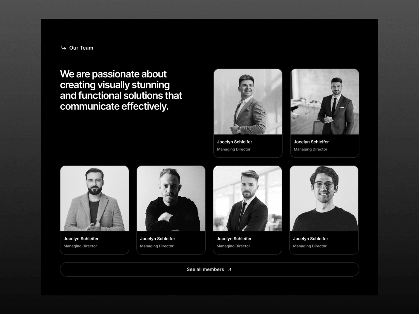
This is a clean, dark-mode team section designed for agency websites, studios, and creative teams that take their visual identity seriously. The layout puts your people front and center — with a bold headline on the left and a structured grid of profile cards on the right.
Each card holds a black-and-white portrait photo, member name, and their role — all sitting inside a dark card with rounded corners. The contrast between the pure black background and the grayscale photography gives it that sharp, editorial look you see on top-tier agency websites.
Whether you are building a design agency site, a consultancy homepage, or a SaaS company about page, this section slots right in. Just swap the photos, update the names, and ship it.
- Pure black background with high-contrast grayscale cards
- 6-member grid layout with flexible profile card structure
- Full auto-layout — resize without breaking anything
- Ready to drop into any dark-mode website design
- Comes as a clean .fig file — open and edit right away