

Hero Section Design: 6 Layouts With Free Figma Examples
Short answer: a good hero section tells visitors what you offer in one headline, supports it with a single clear button and a strong visual, and loads fast. Below are six hero section layouts, each with a free Figma template you can open and edit.
Last updated: October 11, 2026
In this guide
- What a hero section is
- The four parts of a hero section
- A hero section checklist
- 6 hero section layouts with free Figma examples
- How to test a hero section
- Common hero section mistakes
- FAQ
What is a hero section?
The hero section is the first full-width block a visitor sees at the top of a page, usually containing the headline, a short supporting line, a main button and a visual. Its job is to answer three questions quickly: what is this, who is it for, and what should I do next.
The four parts of a hero section
Most hero sections are built from the same four parts. Knowing them makes any template easier to edit:
- Headline: the most important text on the page. It should state the value of your product or service in a few words.
- Subheading: one or two sentences that add context, such as who it is for or how it works.
- Call to action: the main button. It should stand out from the page and say what happens next, for example "Book now" or "Download free".
- Visual: a photo, illustration or product view that supports the message.
A hero section checklist
- One clear headline. Say what you do in plain words. Save clever wording for later in the page.
- One primary button. A second, quieter button is fine, but make one action obvious.
- A visual that supports the message. Use a photo, product view or illustration that shows what you offer.
- Readable contrast. Text over images needs an overlay or a calm area of the photo.
- Light enough to load fast. A heavy hero image slows the first thing visitors see. Compress it and size it for the screen.
- Mobile first. The headline and button must still fit and read well on a phone.
6 hero section layouts with free Figma examples
1. Full-bleed photo with a giant headline
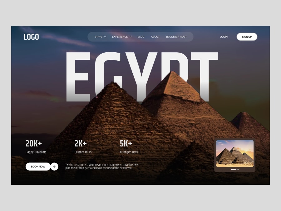
A single destination photo fills the screen and a huge headline sits behind or over it. Our travel website hero section uses giant lettering over a pyramids photo, a glass navigation bar, three stats, a Book Now button and a small image carousel. Works well for: travel, events and any brand with one strong photograph.
2. Photo with floating badges
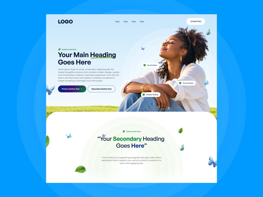
A calm photo with small rounded labels floating around the subject adds warmth and quick reassurance. The wellness and mental health hero pairs a soft sky-blue background with check-badges, butterflies and leaf details, plus a primary and secondary button. Works well for: therapy, coaching, meditation and wellness brands.
3. Dark hero with product cards
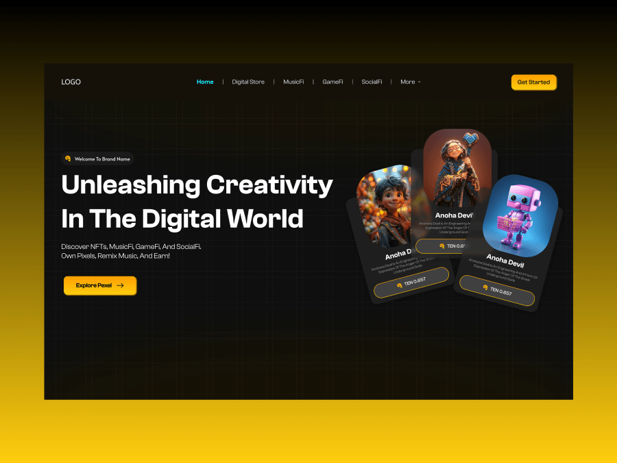
Showing the product itself in the hero helps visitors understand the offer at a glance. The dark NFT marketplace hero uses a black background, a bold headline, a yellow call-to-action and a fan of three rounded cards with price tags. Works well for: marketplaces, digital collectibles and Web3 landing pages.
4. Cinematic, atmospheric hero
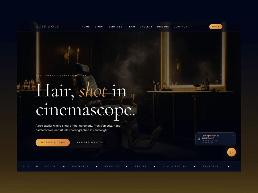
A moody photograph and an elegant serif headline create a premium feeling before a word is read. The luxury dark salon hero uses a navy-black photo hero, a gold italic word in the headline, two buttons and a service ticker underneath. Works well for: salons, barbers, restaurants and boutique brands.
5. Studio hero with imagery and a client row
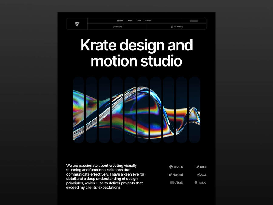
For studios, showing work and showing trust in the same screen is efficient. This dark hero section design template has a top navigation, a large headline, a vertical row of ten pill-shaped glass ribbons for imagery, an intro paragraph and a row of six client logos. Works well for: design and motion studios, agencies and portfolios. Use real client logos only.
6. Grid hero with stats and a floating result card
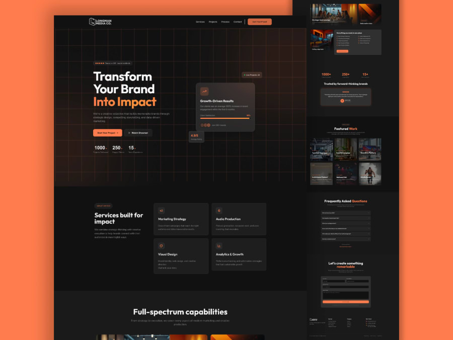
A subtle grid, a floating card and a short stats row make an agency hero feel concrete. The hero of our dark media agency landing page combines a grid background, an orange headline highlight, a floating results card and three stats. Replace the sample numbers with your own real figures. Works well for: marketing and creative agencies.
See all of them in one place: free Figma hero section templates.
How to test a hero section
Design opinions are a starting point, not proof. Once a page is live, change one thing at a time, such as the headline wording or the button text, and compare how many visitors click the main button. Also check the page on a real phone and on a slow connection, because hero images are often the largest file on the page. A hero is not required on every page either: if you cannot give it a clear message and one action, a simpler top section is better.
Common hero section mistakes
- Vague headlines. "Welcome to our website" tells visitors nothing. Say what you do.
- Too many buttons. Three equal calls to action split attention and reduce clicks.
- Text that is hard to read. Low contrast over a busy photo makes the headline disappear.
- Huge uncompressed images. They slow down the first view, which is the one that matters most.
- Claims you cannot prove. Only show stats, awards and logos that are real.
- Forgetting mobile. A beautiful desktop hero can break on a small screen.
How to use these Figma hero templates
Open a template's Figma preview, then download the .fig file and import it into your account. If you have not done that before, follow our guide to opening and importing a .fig file in Figma. After that, replace the text and image, adjust the colors and check the mobile layout.
FAQ
How tall should a hero section be?
Many sites make the hero fill most of the first screen so the headline and button are visible without scrolling. Test on a laptop and a phone to be sure the button stays visible.
Should a hero section have a photo or an illustration?
Use whichever shows your offer more honestly. Photos suit services and travel, product views suit software and marketplaces, and illustrations suit abstract topics.
How many words should a hero have?
Keep it short: one headline of about six to ten words and one or two supporting sentences.
Are these hero templates free to use?
Yes, each one has a free .fig download. Usage rules are in our Terms of Service.
Can you design a custom hero for my brand?
Yes. See the design plans for custom landing page and UI/UX work, or send a message through the contact page.