

Figma Auto Layout for Beginners: Hug, Fill and Fixed
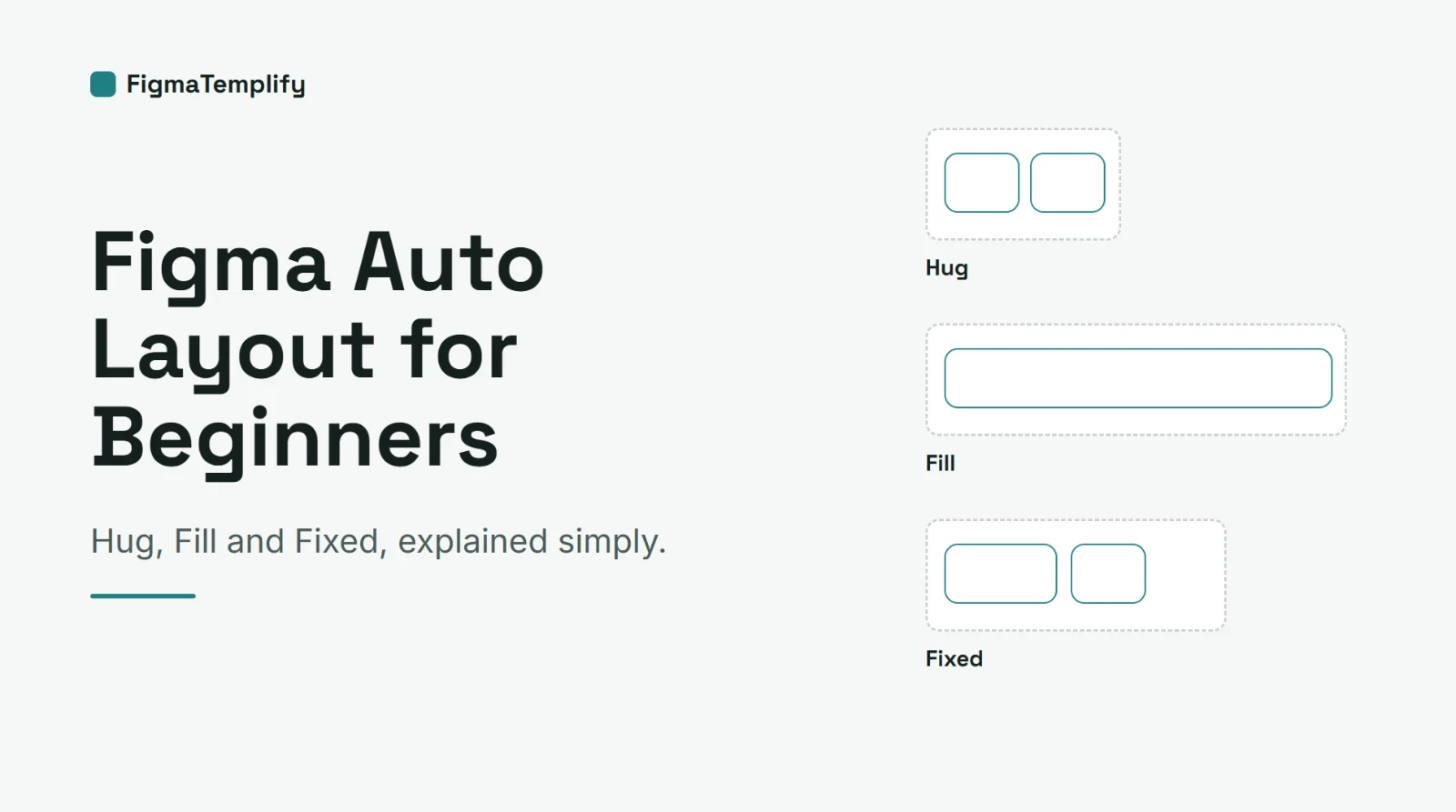
Short answer: Auto Layout makes a Figma frame arrange its contents automatically. You choose a direction, a gap between items and padding around them, and then decide whether each item should hug its content, fill the space or stay a fixed size. It is the main tool for building buttons, cards and page sections that resize without manual fixing.
Last updated: October 16, 2026
In this guide
- What Auto Layout is and why it helps
- How to add Auto Layout
- Direction, gap and padding
- Hug, Fill and Fixed
- A 5-minute practice exercise
- Auto Layout and templates
- Common mistakes
- FAQ
What Auto Layout is and why it helps
Without Auto Layout, every element on a frame sits at a fixed position. Change the text of a button and you have to resize the button and move everything around it. With Auto Layout, the frame reacts to its content. Add an item and the frame grows; remove one and the spacing closes up. This saves time when you edit designs, and it is also how many designs are built to be easy to reuse, such as cards, lists, navigation bars and page sections.
How to add Auto Layout
- Select one or more layers, or a frame.
- Press Shift + A, or right-click and choose "Add auto layout".
- Figma wraps the selection in an Auto Layout frame. Use the Auto Layout section in the right-hand panel to change its settings.
Menu names can change between Figma versions, so if you do not see these options, look for the Auto Layout section in the right panel.
Direction, gap and padding
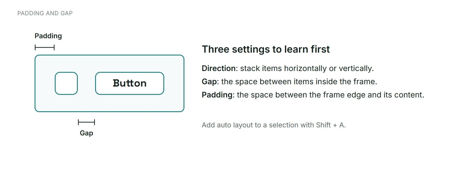
Three settings control most layouts:
- Direction: items stack horizontally (side by side) or vertically (one under another).
- Gap: the space between the items inside the frame.
- Padding: the space between the edge of the frame and its content.
Set a consistent gap and padding and your design looks tidy without measuring each space by hand. Many designers use a small set of spacing values, such as 8, 16 and 24, so everything feels related.
Hug, Fill and Fixed
This is the part that confuses most beginners. These options describe how something is sized:
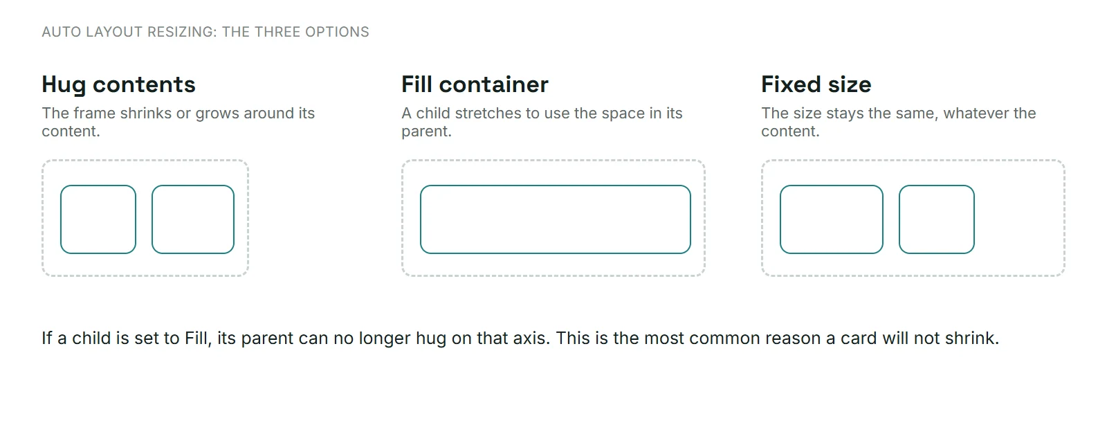
Hug contents
The frame shrinks or grows to fit what is inside it, while keeping the gap and padding. A button that hugs its text gets wider when the label gets longer. Hug is the default when you add Auto Layout to a frame.
Fill container
This applies to an item inside an Auto Layout frame. The item stretches to use the space available in its parent. A text field set to Fill grows to the width of its card, whatever the card's width.
Fixed size
The width or height stays the same, regardless of content. Use it when something must keep an exact size, such as an icon or an image slot.
The one rule to remember
If an item inside a frame is set to Fill on one direction, that frame can no longer hug in that direction. This is the usual reason a card "will not shrink". If your frame will not behave, check the sizing of its children.
A 5-minute practice exercise
- Create a text layer that says "Button". Select it and press Shift + A. You now have an Auto Layout frame that hugs the text.
- Set the padding to 16 on the sides and 12 at the top and bottom. Add a fill color and rounded corners.
- Change the text to a much longer label. Notice that the button grows by itself.
- Add a small icon next to the text. Set the gap to 8 and the direction to horizontal.
- Place the button inside a wider Auto Layout frame and set the button to Fill. It now stretches to the frame width.
Auto Layout and templates
When you edit a template, check how its sections are built: select a frame and look for the Auto Layout section in the right-hand panel. If a section uses Auto Layout, adding or removing an item adjusts the spacing for you. If it does not, you may need to move things by hand, or add Auto Layout yourself with Shift + A.
Start with a simple one-page design from our free landing page templates, then follow our guide to customizing a Figma template in 15 minutes. To plan the sections of a page first, read about landing page sections.
Common mistakes
- Setting everything to Fixed. Then nothing adjusts when the content changes.
- Mixing Fill and Hug without a plan. Decide per item which one should flex.
- Random spacing. Use a few consistent gap and padding values.
- Nesting too deep. A frame inside a frame inside a frame is hard to edit. Keep structure simple and name your layers.
- Forgetting the mobile frame. Check how your layout behaves at a phone width.
FAQ
What is the shortcut for Auto Layout in Figma?
Shift + A adds Auto Layout to the selected layers or frame.
What is the difference between Hug and Fill?
Hug sizes a frame to fit its content. Fill sizes an item to fill the space in its parent frame.
Why won't my frame shrink?
Often an item inside is set to Fill, which stops the parent from hugging in that direction. Change the child to Hug or Fixed, or the parent to Fixed.
Do I need Auto Layout for every design?
No, but it saves a lot of time on buttons, cards, lists and sections that change.
Is Auto Layout the same as constraints?
No. Constraints describe how a layer behaves when its parent frame is resized. Auto Layout arranges and sizes the items inside a frame.
Where can I practice with real designs?
Download a free template from the FigmaTemplify library, import it (see how to open a .fig file) and try adding Auto Layout to a section. Usage rules are in the Terms of Service.