

Landing Page Sections: What Every Landing Page Needs
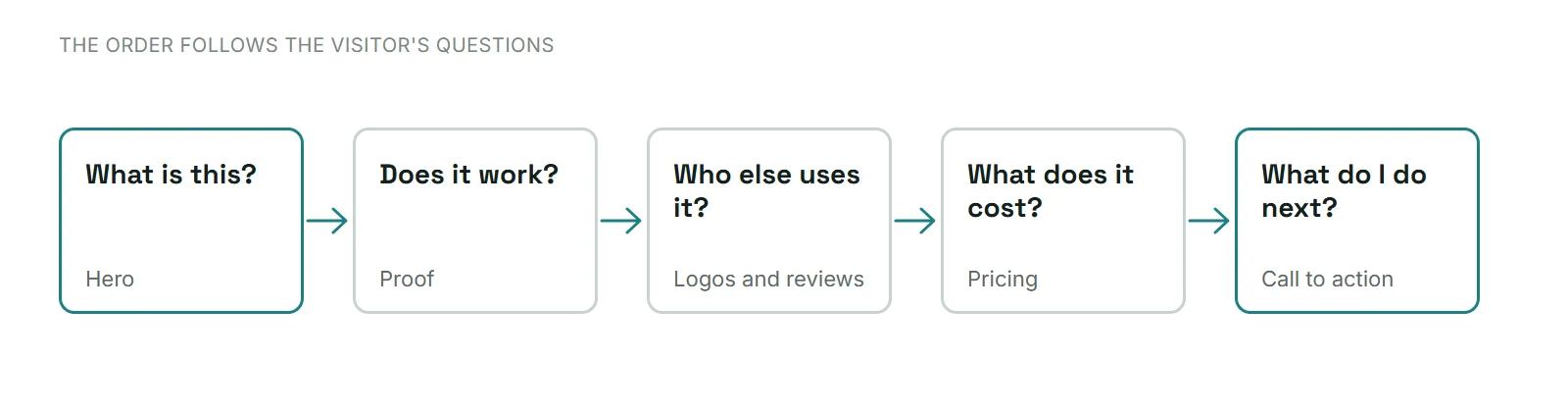
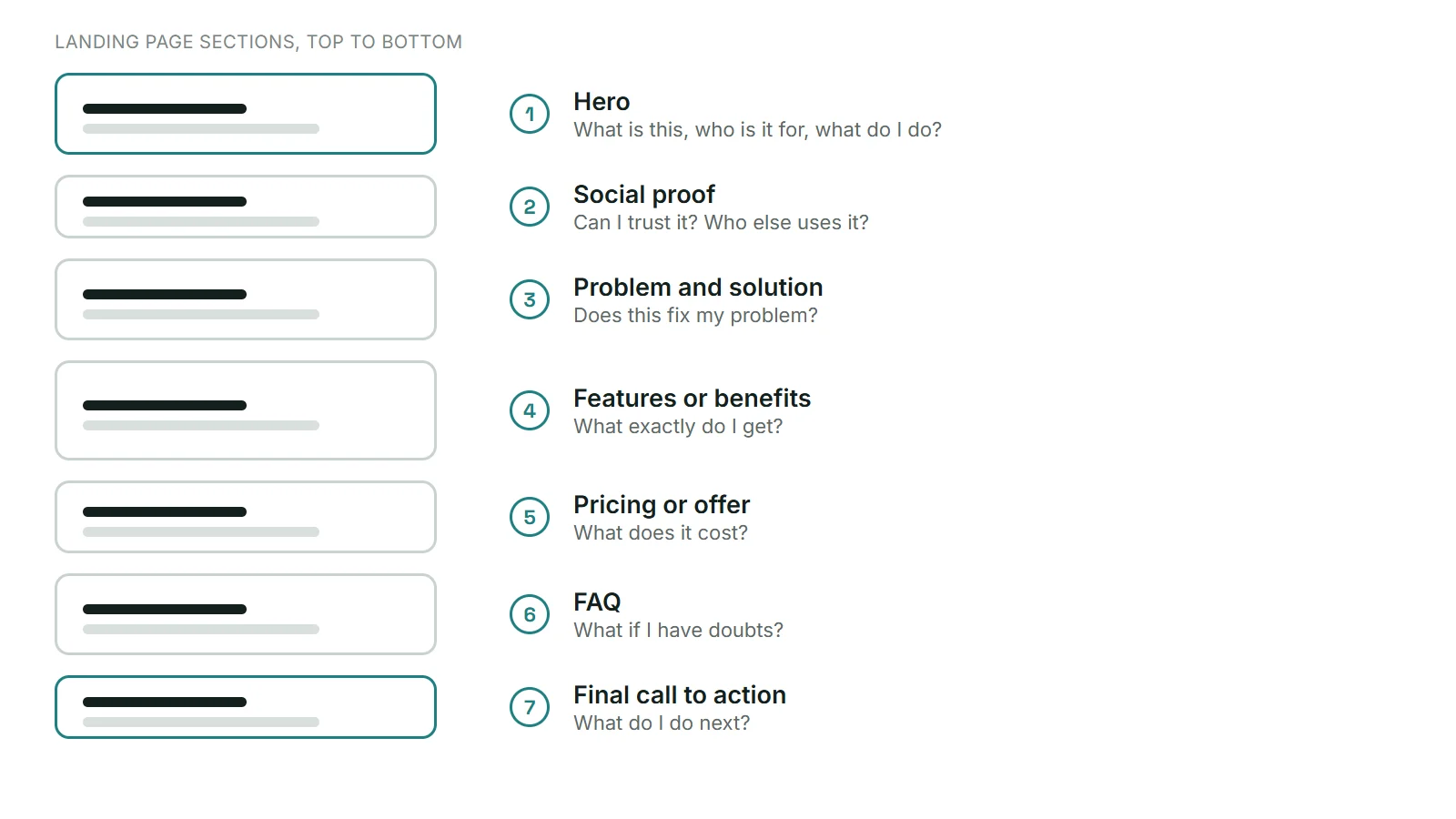
Short answer: a good landing page usually has a hero, proof (logos or testimonials), an explanation of the problem and solution, features or benefits, pricing or the offer, an FAQ and a final call to action, in that order. The order matters because each section answers the question a visitor has right after the one before it.
Last updated: October 16, 2026
In this guide
- Why the order of sections matters
- The 7 sections, one by one
- Which sections do you actually need?
- How to build the page in Figma
- Common mistakes
- FAQ
Why the order of sections matters
Visitors do not read a landing page like a book. They scan, ask themselves a few questions, and leave as soon as a question goes unanswered. Most landing page guides agree on the same flow: a clear promise first, then proof, then answers to doubts, then one clear action. If you put pricing before anyone knows what you do, or a call to action before any proof, you lose people.
The 7 sections, one by one
1. Hero
The hero answers three questions in a few seconds: what is this, who is it for, and what should I do? It needs a specific headline, one supporting line, one main button and a visual that fits the message. Keep the main action obvious; a second, quieter button is fine.
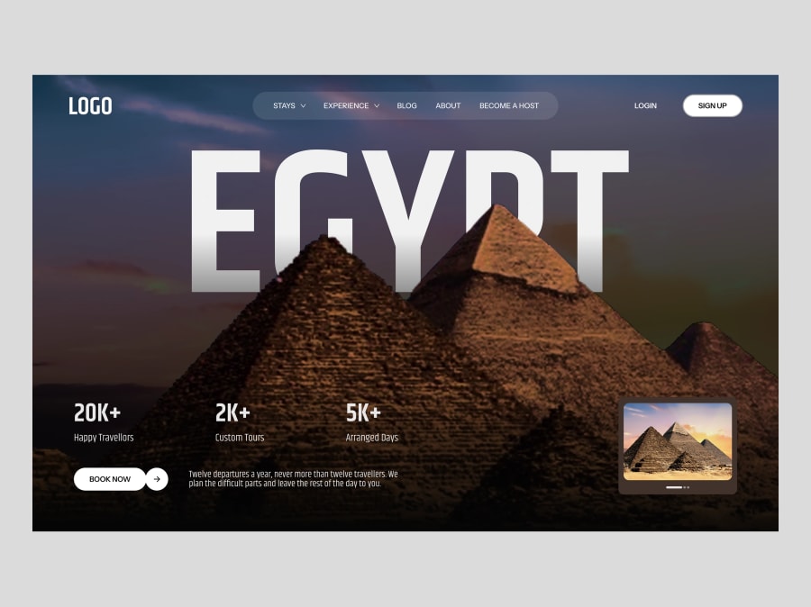
Example: the travel website hero section has a headline, stats and a Book Now button. More layouts are in our post on hero section design.
2. Social proof
Right after the promise, visitors ask whether they can trust you. Show real client logos, short testimonials or reviews. Use only proof that is real; invented numbers and fake quotes damage trust and can cause legal problems.
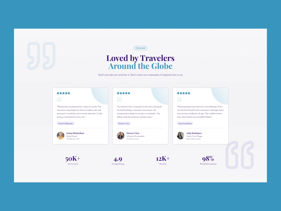
Example: the testimonials section template has three review cards and a stats row. Replace the sample quotes with your own real ones.
3. Problem and solution
Explain the problem your visitor has in their own words, then show how your offer solves it. Two or three short paragraphs or a simple before and after are enough.
4. Features or benefits
Now say what exactly they get. Lead with the benefit ("save hours on every page") and support it with the feature. A grid of three to six items works well and is easy to scan.

Example: the IT services grid section shows six services as cards. See more section layouts in the services section templates.
5. Pricing or the offer
If price decides the sale, show it clearly. Say what is included, and make the main plan easy to spot. If you do not publish prices, explain how the process works and what the first step is.
6. FAQ
The FAQ handles last-minute doubts: cost, timing, refunds, support, "is it right for me?". Put the real questions customers ask first. Short, direct answers work best.
7. Final call to action
End with one clear action, repeating the promise from the hero. A simple band with a headline and one button is enough. Add a short footer with contact links and legal pages below it.
A full landing page that combines most of these sections is the real estate marketing agency landing page, which has a hero, service cards, testimonials, a call-to-action band, an FAQ and a footer.
Which sections do you actually need?
Not every page needs all seven. Use this as a guide:
| Goal of the page | Sections to prioritize |
|---|---|
| Newsletter or download | Hero, short benefits, one call to action |
| Service enquiry | Hero, proof, benefits, process, FAQ, call to action |
| Paid product or plan | Hero, proof, features, pricing, FAQ, call to action |
| Event or booking | Hero, key details, proof, booking call to action |
If a section does not help the visitor decide, remove it. A shorter page that answers every question beats a long page that does not.
How to build the page in Figma
- Start from a template. Browse the free landing page templates and choose one with a structure close to your goal.
- Write the text first. Draft the hero headline and the question each section answers before you touch the design.
- Keep sections separate. Use one frame per section so you can reorder or remove them easily. Our guide to Figma Auto Layout helps keep spacing consistent.
- Check mobile. Many visitors arrive on a phone, so make sure headlines and buttons fit.
- Edit with a plan. Follow our steps to customize a Figma template quickly.
Common mistakes
- Many equal buttons. One main action is clearer than five.
- Proof that is not real. Only show testimonials, logos and numbers you can back up.
- Features without benefits. Say what the visitor gains, not just what the product has.
- Hiding the price when price is the question. If visitors cannot find it, they leave.
- No answer to objections. Use the FAQ to answer the doubts you hear most.
FAQ
How many sections should a landing page have?
As many as it takes to answer the visitor's questions, and no more. Five to seven is common for services and products; a simple sign-up page may need only two or three.
What should be at the top of a landing page?
A hero with a specific headline, a supporting line, one main button and a visual that shows what you offer.
Where should the FAQ go?
Usually near the end, before the final call to action, so it can answer remaining doubts just before the visitor decides.
Do I need testimonials?
They help when they are real. If you do not have any yet, use other proof such as a clear process, sample work or a guarantee you can honor, and add testimonials later.
Where can I find a free landing page template?
The FigmaTemplify landing page templates are free to preview and download as .fig files. Usage rules are in our Terms of Service.
Can you design a landing page for me?
Yes. See the design plans or send a message through the contact page.