
Dark Mode UI Design: 7 Tips With Free Figma Examples
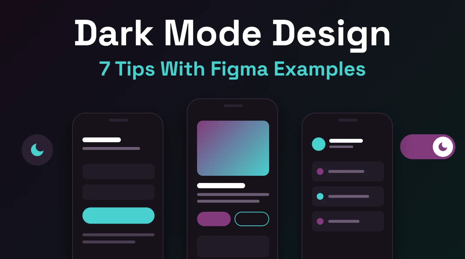
Short answer: good dark mode design is not just inverted colors. Use dark gray surfaces, keep text contrast high, limit saturated colors to one accent, separate layers with lighter surfaces instead of heavy shadows, and let people choose their theme. Below are seven tips, each shown with a free dark Figma template. Last updated: October 11, 2026 In this guide Tip 1: Start from dark gray, not only pure black Tip 2: Keep text contrast high Tip 3: Soften white text on dark backgrounds Tip 4: Choose one accent color Tip 5: Show depth with surfaces, not shadows Tip 6: Do not simply invert images and colors Tip 7: Let people choose the theme FAQ Tip 1: Start from dark gray, not only pure black Pure black can look harsh against bright text and makes it hard to show layers. Many design systems recommend a very dark gray or a dark tinted color for the base background, then slightly lighter surfaces for cards and panels. Pure black can still work, especially for bold, minimal designs, so judge by the result on a real screen. Example: the dark minimal Our Team section uses a black background with grayscale portraits and rounded cards for a clean, high-contrast look. Tip 2: Keep text contrast high Readability is the main job of any theme. The Web Content Accessibility Guidelines suggest a contrast ratio of at least 4.5:1 for normal text and 3:1 for large text. Check your text and button colors with a contrast checker, especially for gray secondary text, which often becomes too dim on dark backgrounds. Example: the dark media agency landing page pairs white headlines and an orange accent with charcoal surfaces. Tip 3: Soften white text on dark backgrounds Bright white text on a very dark background can glow and tire the eyes in long reading. Consider an off-white for body text and keep pure white for headlines or key numbers. Use size and weight, not just color, to separate headings from body copy. Tip 4: Choose one accent color On dark backgrounds, saturated colors stand out a lot. Pick one main accent for buttons and highlights, and keep everything else neutral. Slightly softer, less saturated versions of your brand color often look better on dark surfaces than the exact light-mode color. Example: the dark marketplace hero section uses a single yellow accent on black. Tip 5: Show depth with surfaces, not shadows Drop shadows are hard to see on dark backgrounds. To show that a card or menu sits above the page, use a slightly lighter surface color or a thin subtle border instead. The higher the element, the lighter its surface. Example: the dark multi-column footer separates areas with thin dividers and a slightly different surface rather than shadows. Tip 6: Do not simply invert images and colors Automatic inversion usually breaks photos, brand colors and illustrations. Check each image on the dark background: bright photos may need a subtle overlay, and logos may need a light version. Redesign key colors on purpose instead of flipping them. The luxury dark salon website shows how a dark, moody photo and gold accents create a premium feeling when the whole page is designed for dark from the start. Tip 7: Let people choose the theme Some people prefer dark, some light, and some change with the time of day. Browsers can tell a website which theme the visitor's device prefers, using the prefers-color-scheme media query. A good approach is to follow that preference by default and also offer a toggle. In Figma, design both themes and test key screens in each. Example: the dark mode app sign-in screens show a full dark flow with a neon green accent. A quick dark mode checklist Base background is dark gray or a dark tint; layers use lighter surfaces. Body text and buttons pass contrast checks. One accent color, used sparingly. Shadows replaced by surface color or borders. Images, icons and logos checked on dark. Theme follows the device setting and can be switched. Tested on a real phone and a real monitor, in a dim room and in daylight. See every dark design in one place: free dark mode Figma templates . To edit one, follow our guide to customizing a Figma template . FAQ Is dark mode better than light mode? Neither is better for everyone. Dark mode can be more comfortable in low light and suits some products and brands; light mode often works well in bright settings. Offering both is the safest choice. Should dark mode use pure black? It can, but many designers prefer very dark gray so layers and shadows are easier to show. Test both on real screens. What contrast ratio should dark mode text have? Aim for at least 4.5:1 for normal text and 3:1 for large text, following the Web Content Accessibility Guidelines. How do I design dark mode in Figma? Create a dark version of your color styles or variables, apply them to your frames, and check each screen. Starting from a dark template saves time: download one from our dark mode templates and edit it. Are the dark templates free? Yes. Each has a free .fig download. Usage rules are in our Terms of Service . Can you design a dark mode version of my product? Yes. See the design plans or send a message through the contact page .
View Full Blog